The Task
A new corporate design was developed for Germany's leading brand of premium fine papers and artist papers, with a special focus on rejuvenating the traditional brand.
The Solution
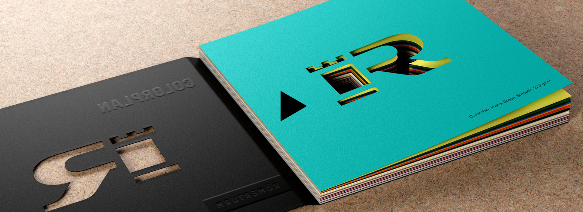
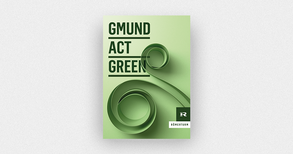
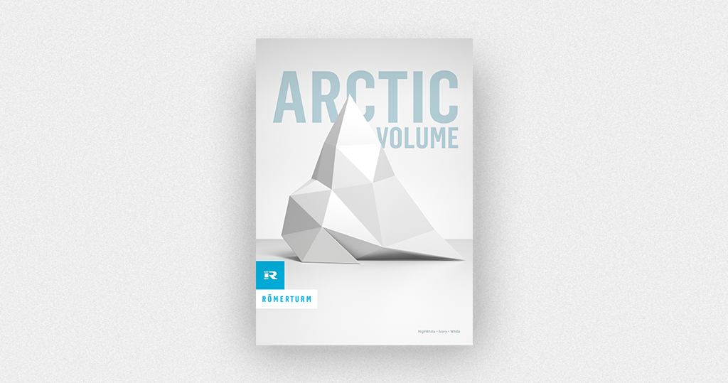
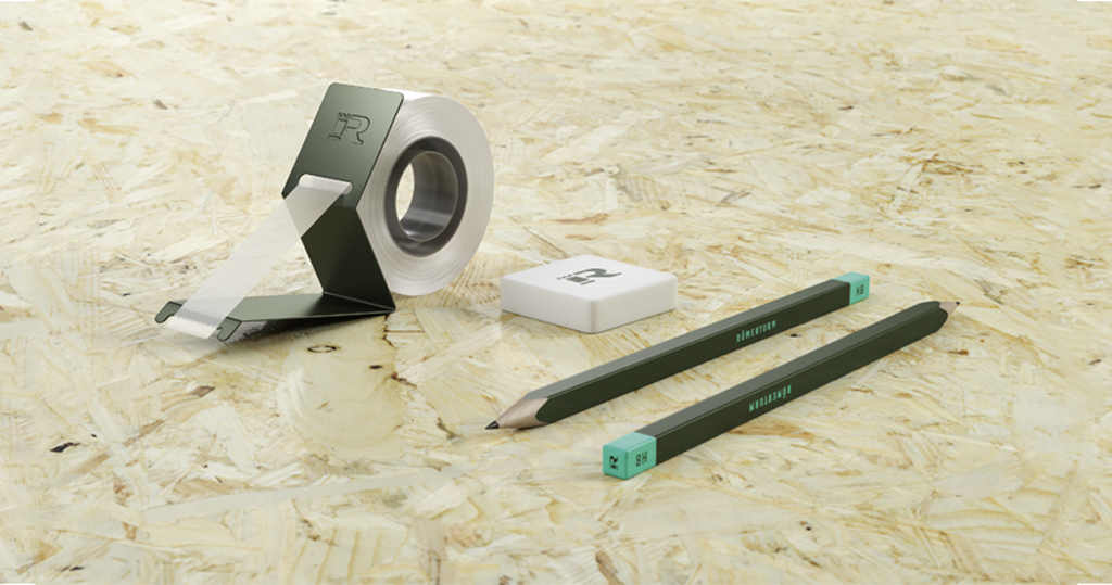
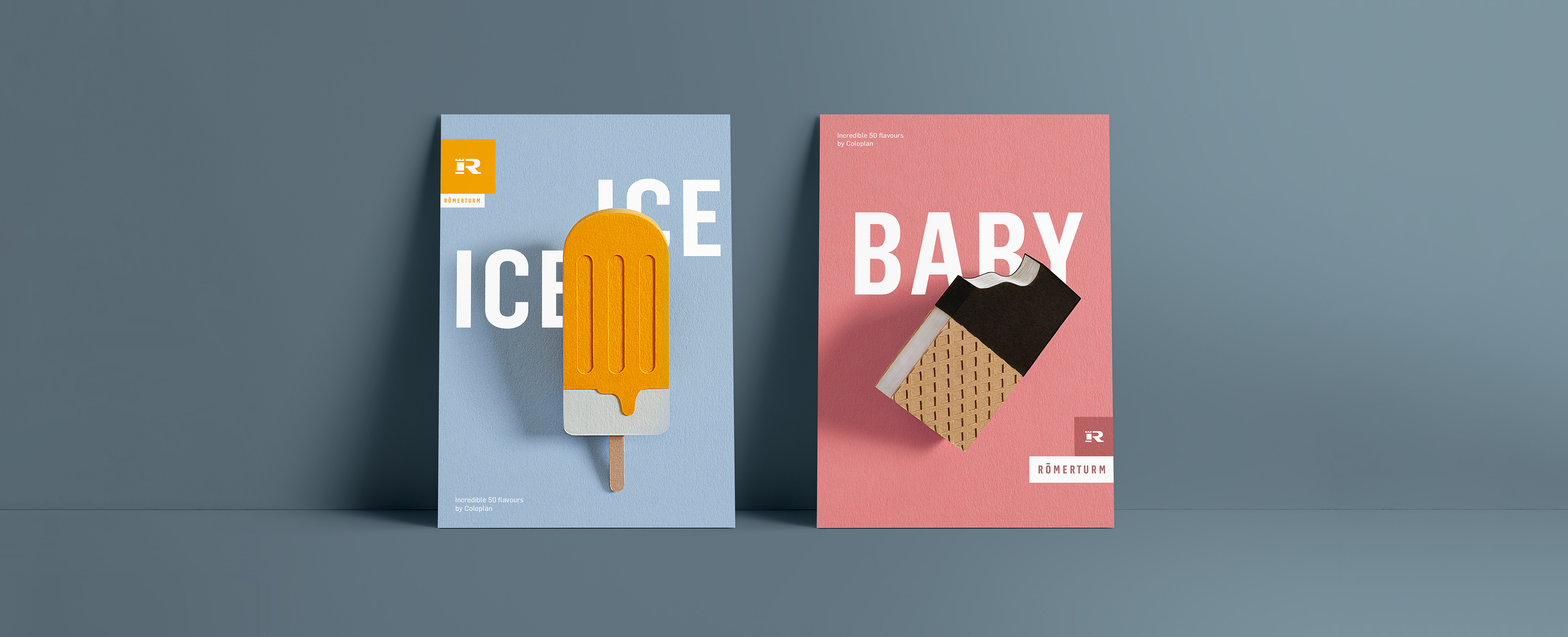
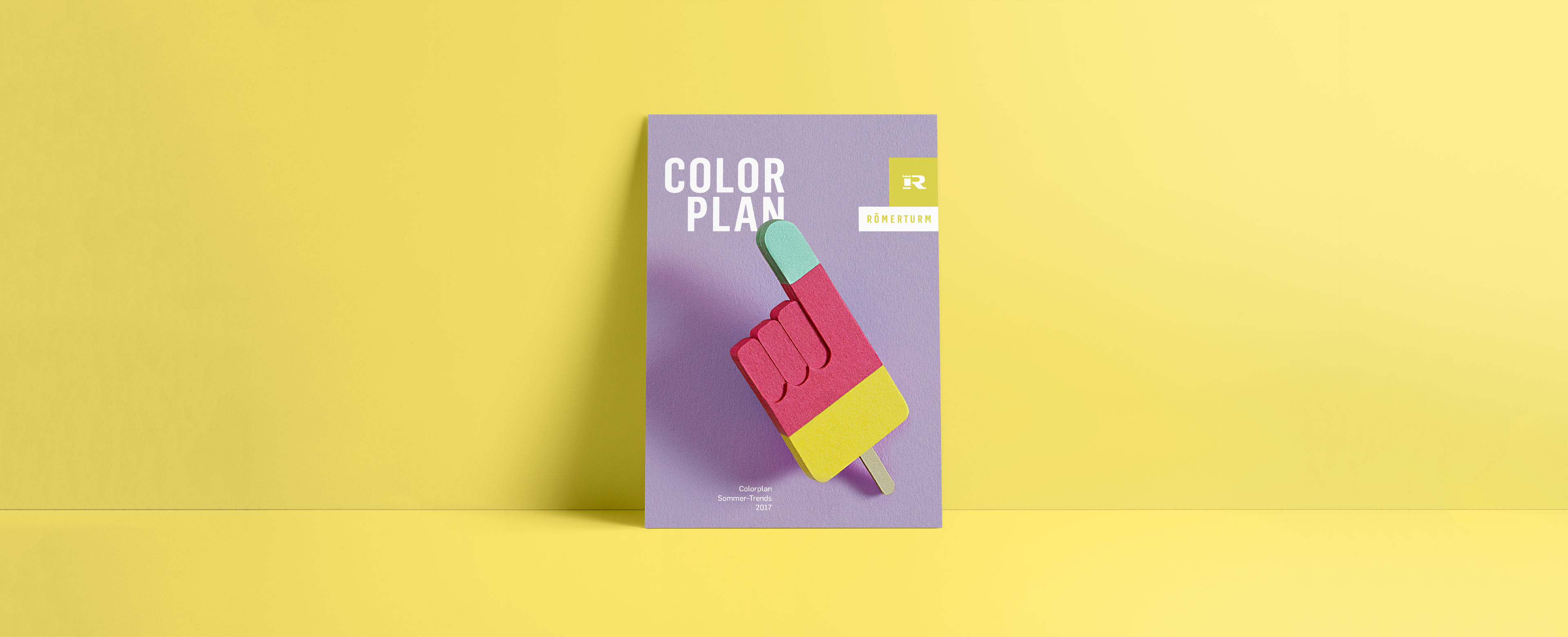
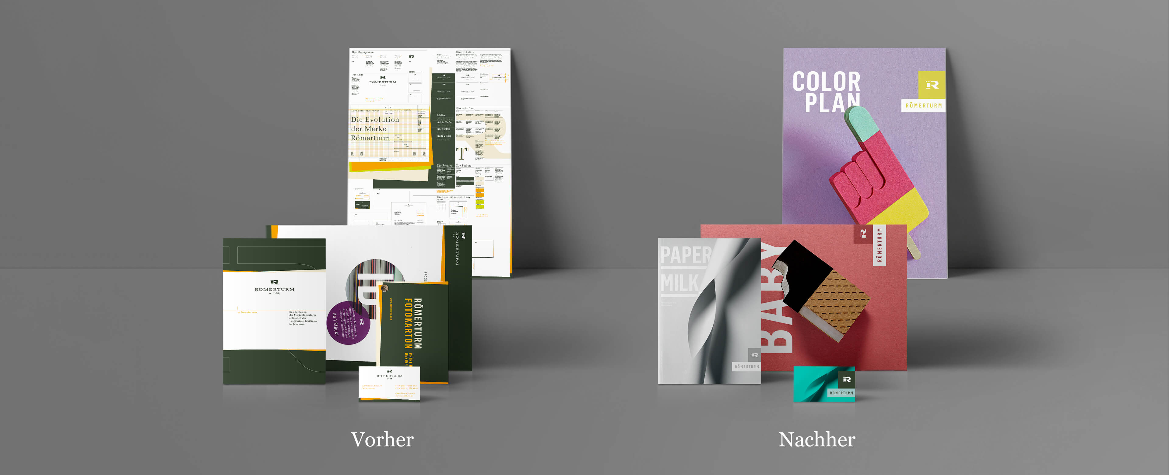
The logo has undergone a careful redesign to give this icon of the graphic design industry a contemporary feel – and has been further developed for digital use. The proportions of the monogram were optimised and placed within a solid form. The new corporate type replaces the traditional serif font, thus creating a timeless and stylistically neutral look. The primary colour “Römerturm green” continues to ensure high recognition but is now used in a modern way: 32 additional colours are available, which lend a freshness to the corporate design.
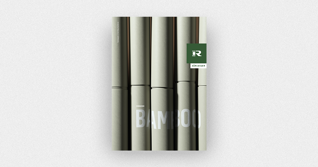
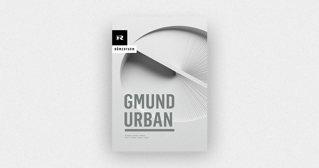
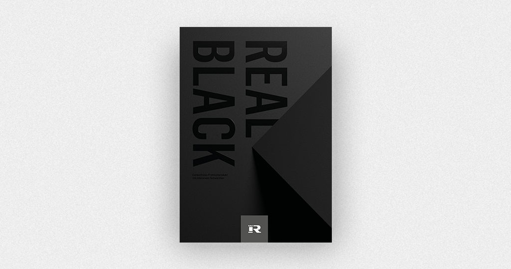
Paper and its use play a special role in corporate design: the new designs now offer a versatile, tangible and haptic experience, becoming the key-visual for the brand identity. The new product presentation celebrates these qualities and brings paper to life.