A strong voice for Düsseldorf:
KW43 Branddesign develops a strong design language for the city of Düsseldorf

A strong voice for Düsseldorf:
KW43 Branddesign develops a strong design language for the city of Düsseldorf

A strong voice for Düsseldorf:
KW43 Branddesign develops a strong design language for the city of Düsseldorf

KW43 Branddesign reinforces Düsseldorf’s excellent reputation at home and abroad with an outstanding design that translates the new positioning »live close, feel free« into powerful imagery.

The Task
To illustrate the advantages of the city with the new positioning utilising the keywords »close« and »free«. KW43 Branddesign’s task was to translate this strong proposition into a design that represents the characteristics of the city and strengthens its positioning.

The Solution
The new design developed by KW43 highlights Düsseldorf’s unique advantages: personal and spatial proximity in unison with the feeling of freedom, together with the distinctive characteristics of the city. The typography is designed in such a way that its headings seem to extend beyond the pages. They express freedom by ignoring conventions. At the same time, the individual lines in a heading come into such close contact that they connect seamlessly in some parts of the design.

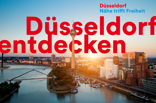
This proximity is also conveyed by the size of the letters in the colour of the city’s coat of arms. They stand for a confident city full of energy and emotion. The visual concept does justice to the »world capital of art photography«: photographs taken by professional and amateur photographers from Düsseldorf conveying a feeling of closeness through their authenticity, warmth and close ties to their hometown.

The Result
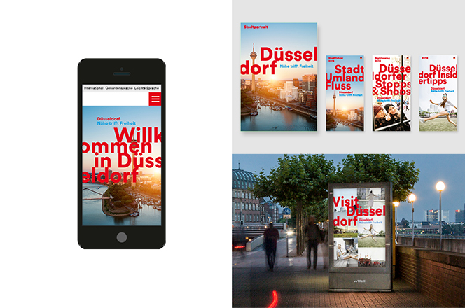
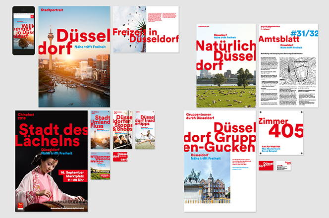
Recognition increased significantly due to the prominent design and distinctive red colour. Its flexible design is not only suitable for digital media but allows it to live independently from the logo. Thus, it deliberately distinguishes itself from other cities that use a logo as a central element in their branding.