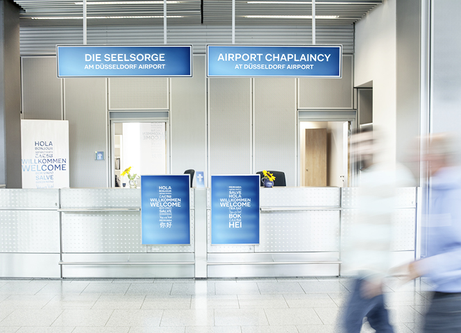
The Task
For the past 16 years Düsseldorf’s airport chaplaincy has provided a point of contact for all people seeking help, regardless of origin or religion. In order to assist those who are seeking help to find their way to the volunteers faster and to strengthen the visible presence of the chaplaincy, the brand appearance was to be modernised and brought into a culturally unbiased context.
The Solution
With the development of a new design it was possible to depict the airport chaplaincy in a contemporary way and to visualise its most important offer: an open approach to every person, regardless of their origin. In return, the cross was reinterpreted as the original Christian symbol, and thus permitting a non-denominational approach.