The task
To develop a modern and timeless corporate design for the family-owned company that represents Osterrath's high standard of technology and quality.
The solution
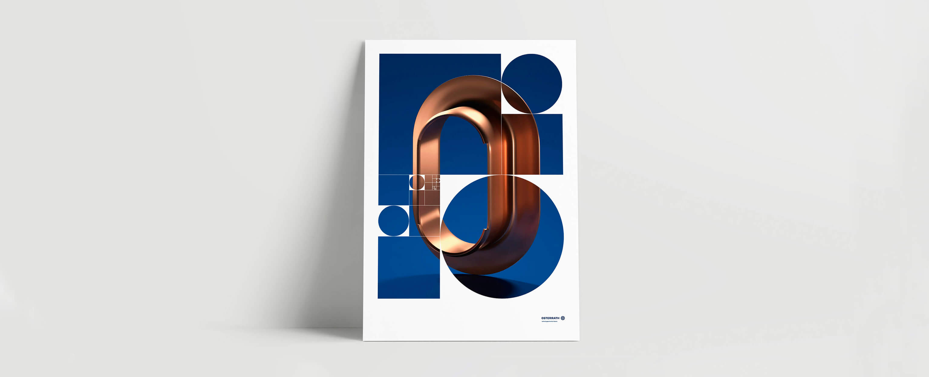
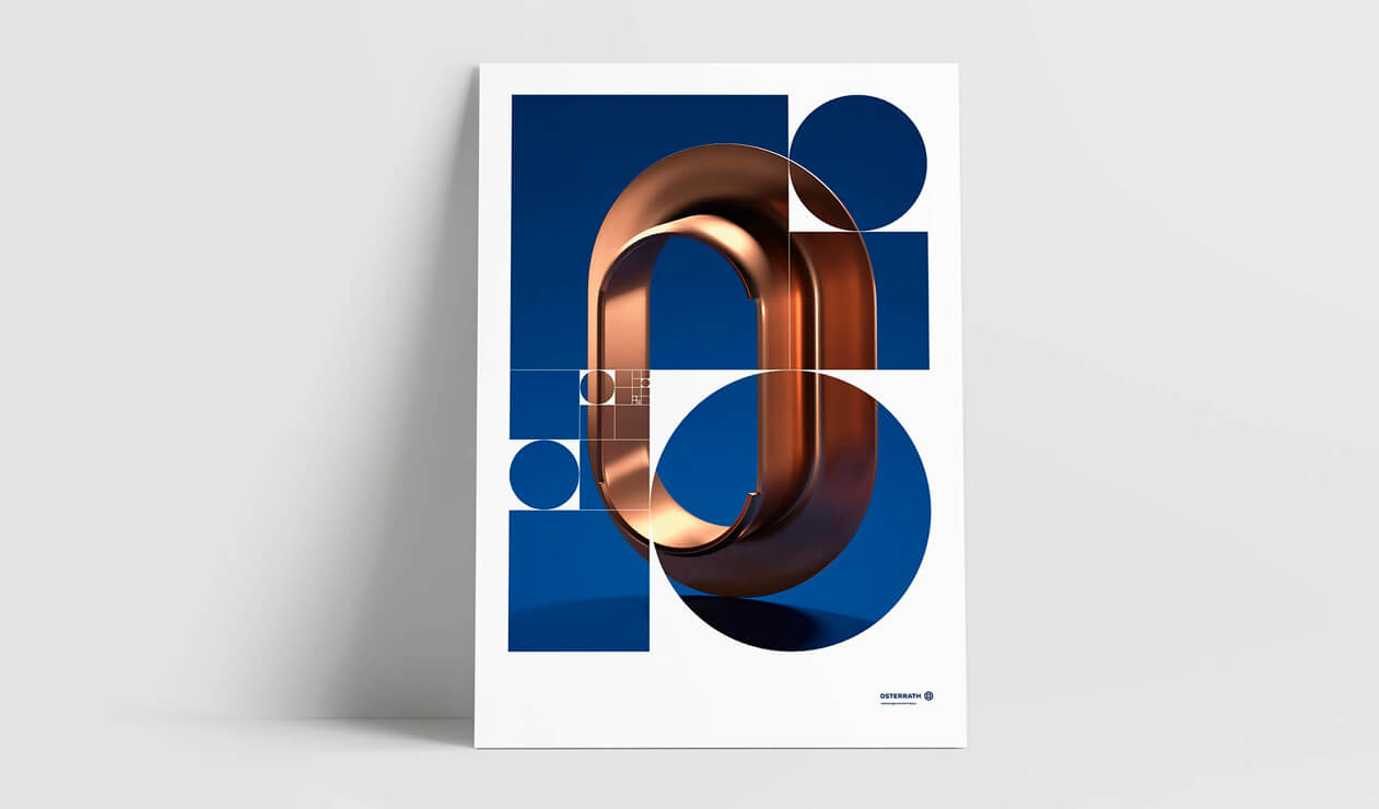
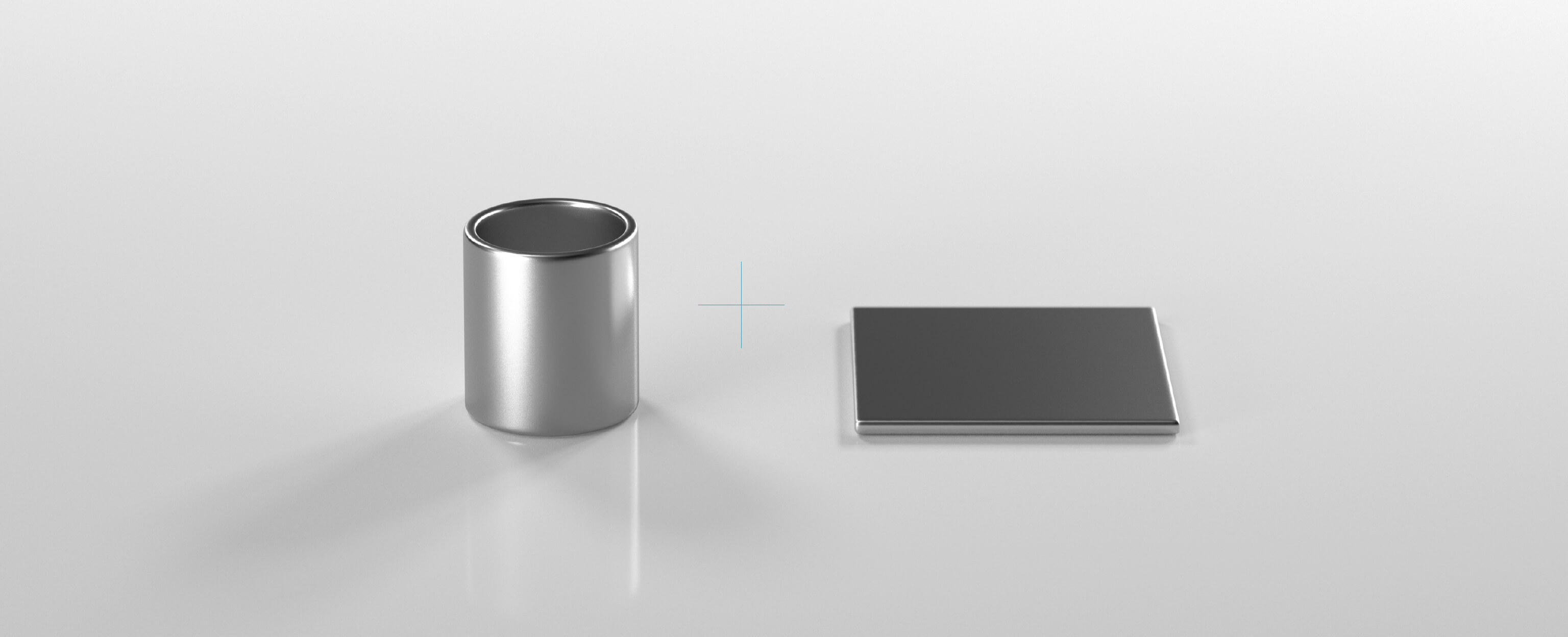
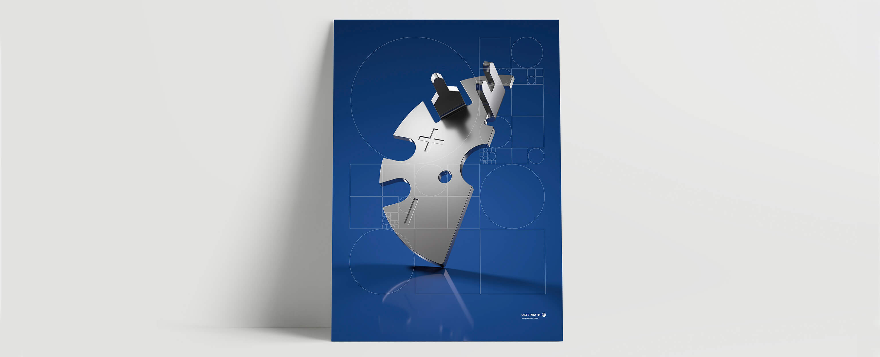
The new design reflects the company's products and shows the connection between the two opposites: The circle and square symbolise the two basic materials used by Osterrath: tube and sheet metal.
The symbol also reminds one of the "squaring of the circle" - the mathematical approach of constructing a square with the same surface from a circle by geometric means.
In general, however, the image of the square is also used as a metaphor for seemingly unsolvable tasks or things that are difficult to connect - and thus for Osterrath's core competence: connector technology Made in Germany.
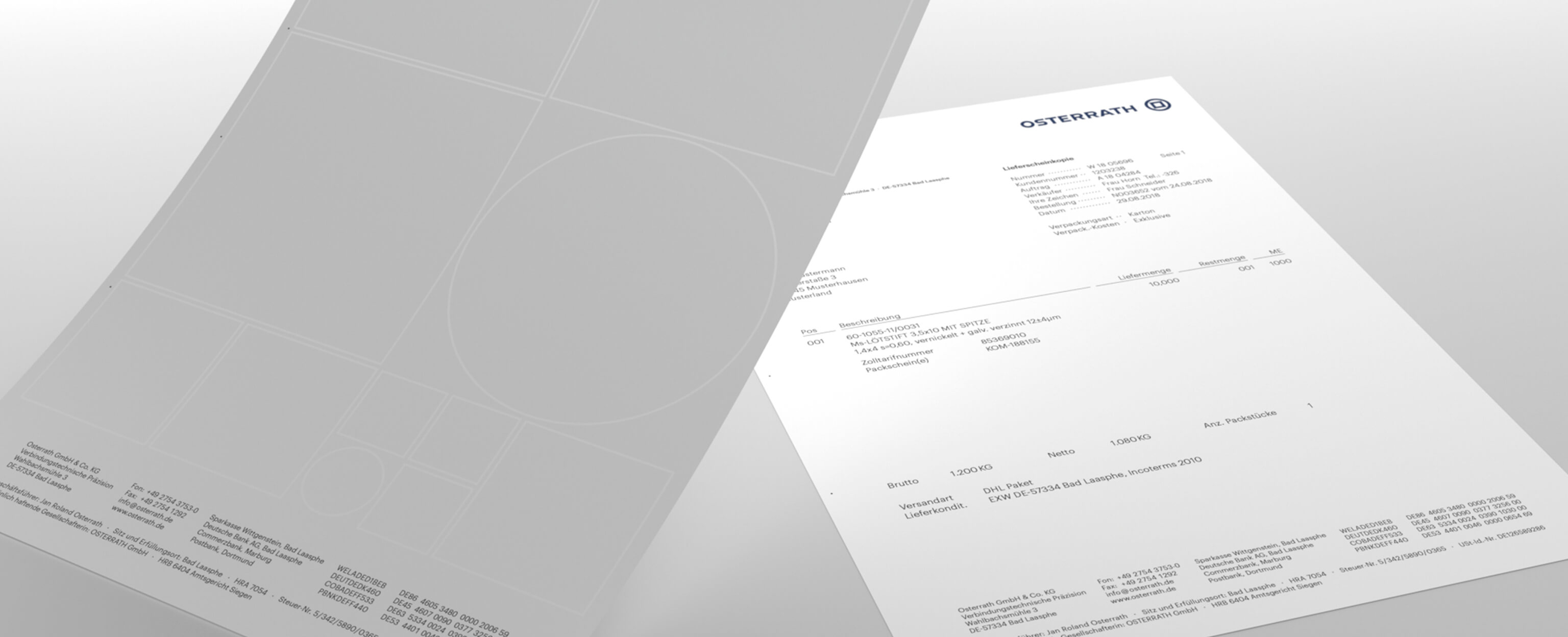
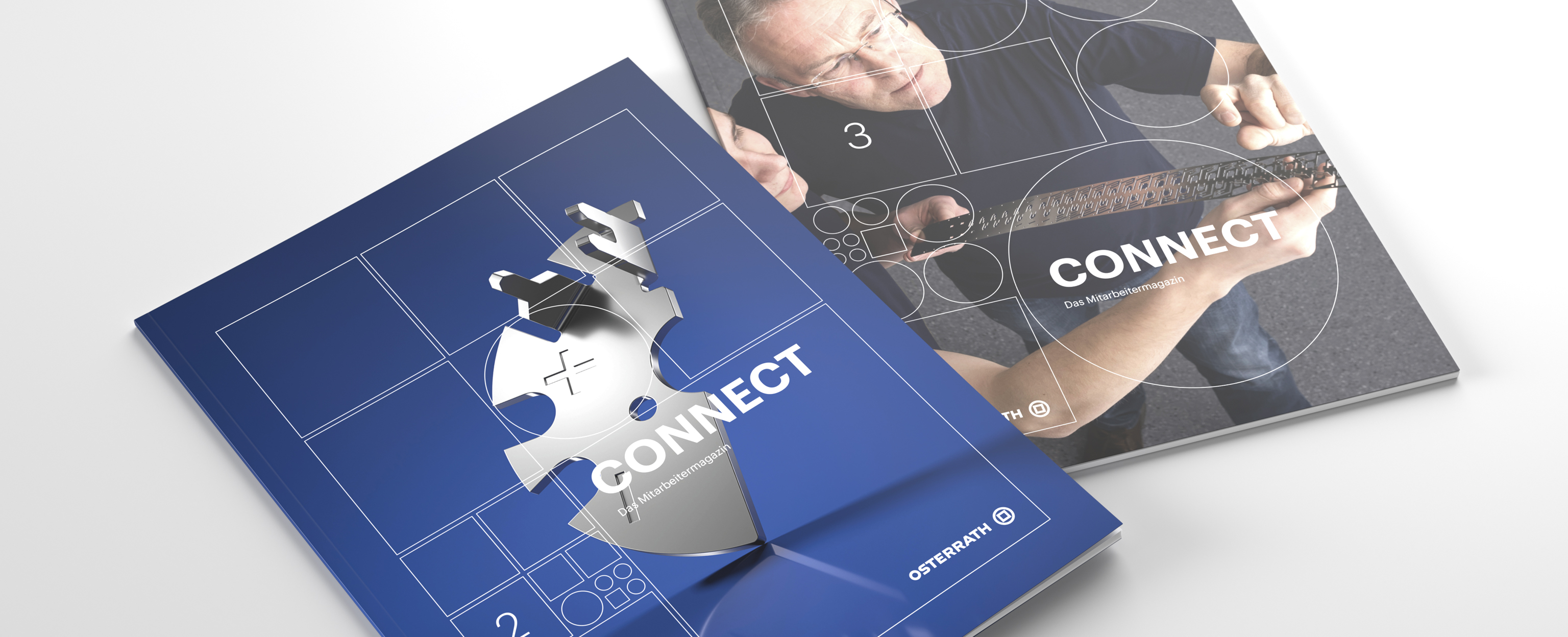
The basic geometric shapes of the new brand are an important identification characteristic: they form a flexible pattern based on punching tools and technical drawings. The pattern assumes structural and functional roles and expresses company-specific topics such as diversity, networking and complexity management.