Clearly more enjoyment:
A logo evolution for Charlotte Eden

Clearly more enjoyment:
A logo evolution for Charlotte Eden

It’s Charlotte Eden’s guiding principle: to effortlessly combat the problem areas without giving up on enjoyment. KW43 lends weight to this with a new branding.

The Task
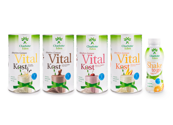
Charlotte Eden is a dietary brand that offers tasty and enjoyable dietary products. To create brand awareness and deliver on its brand promise for their target audience, its positioning needed to be redefined as part of a brand revamp.

The Solution
With a logo evolution, KW43 integrates the sensory experience of taste into the branding and thus gives a boost to the moment of enjoyment as a brand promise. At the same time, the logo emphasises the technical and nutritional integrity of the products.

The Result
Through further development, the delicate branches of the brand’s hallmark tree have been given a more voluminous shape. And with its extension over two lines, the name »Charlotte Eden« comes more to the fore. A larger font makes the products more distinctive and Charlotte Eden’s »personal recommendation« is more apparent. This ensures the continuation of the successful brand placement, strengthening its position within the FMCG sector.